Monday 25 October 2010

Posters

Posters which have been created using my own typface:

Static overload!

I think that I have been staring at Static images for waaay too long! I see it in my dreams! 
Ok well the finalish outcomes are approaching. Suprisingly i've really enjoyed this brief! Mosrt people will kill me for saying that but its true!

Even though it was hard to get started with after a bit once i'd got my idea it was really easy to just go with it! Had a review session today with the tutors and I was really pleased with what was said! My work really does reflect the enjoyment that I have had on this brief...whether it's the tutor or the open ended brief whatever it was has really worked!

My work is still in development but here are the final book which feature the layout and original images: 


Friday 15 October 2010

Alphabet explored!


These are the typography taken into photoshop and altered. I used the background of the scanned images and placed the font over ctreating a whole new font! :)
I still have no idea what to do with these!

Alphabet


Creating my own Font! (Don't worry the road cleaner has washed this right off!) 

Static..

Static....what comes to mind when static is mentioned?
To me there are various things that come to mind
- Interference in T.Vs
- Interference on Radio
- Balloons and hair
- Friction - Rubbings
- Light - Lightning
- White / Pink Noise
- Character - In a fixed motion
- Magnetic?

There are many ways to interpret Static but for the first project of my third year I chose to focus on the word Interference - in telecommunication and electronics, anything which alters, modifies, or disrupts a message as it travels along a channel between a source and a receiver.
I got the obvious things out of the way which involved balloons and static hair. I then came up with the idea of materials which would look like static. I scanned materials and objects which would resemble static when zoomed in on.


Some of the scans have come out really well, I scanned them in and then placed a layer over then to bring the images to life and look like static. After having a consult with John Walsh we came to the conclusion that that these images would look really good as a magazine spread or a background of a collection of poster! Along with these scans I created my own typeface. the first experiment was with the word 'Static'


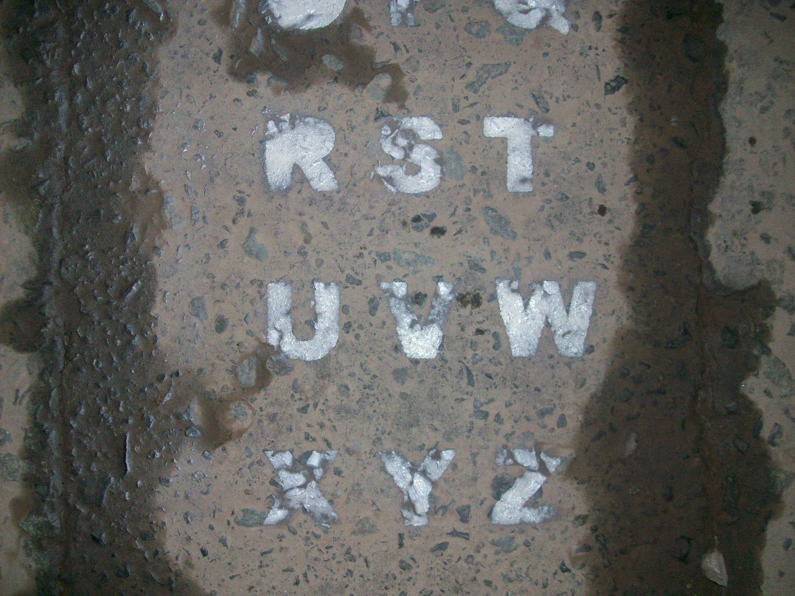
The bottom photo is what inspired me to crteate my own typeface. The blending of the spray paint has become an advantage as it creates a whole new font. I did use the other photo becasue the idea behind these was the idea of the word being static itself and people and the environment around it would be moving and changing. Eventually the word has been washed away by the road sweeper (which is great!) and has worked how i wanted it to! (faded ones shown below!)


Akatre Atelier

Finally I have found an artist which I love...well in this case its a design studio group called Akatre. I stumbled apon them whilst trying to find inspiration for the new project Static. 


There isn't much information about them but they stood out to because I like the way they layout their posters. I love the way the font has been disrupted. It reminds me of static in a sense because it looks like what happens when the TV is interrupted and can't get signal. 

They have also created some covers for Graphix magazine aswell as some titles for typography books. 


 Also create identities for companies. One that stood out was for 'Light the Fire'